Concept

This is the all-purpose column stack. If you know that a particular column of your database does not require any specific formatting, you can just use this stack.
This stack works as a blueprint, so all settings available here will be available in the other Column Stacks as well.

Example

×

Documentation

General

Field Name (DB) - enter the field name exactly as on the database
Field Title - enter the name as you want to see it on the web page
Visible - Enable or disable the display of this column
Editable - Make this column editable
Max. Length - Set the maximum length of the input field if Editable is selected. Should be the same value as in the field definition in your database
Orderable - Enable or disable ordering on this column
Searchable - Enable or disable search on the data in this column

Validator

Required - Marks this field as required in the edit/add modal window and validates if an entry is present

Column Layout

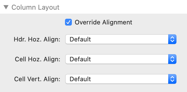
Override Alignment - Instructs the Column stack to apply its own alignment settings, thus overriding the table-wide settings
Hdr. Hoz. Align - Choose the alignment option for the header - Default, Left, Center, Right
Cell Hoz. Align - Choose the alignment option for the cell - Default, Left, Center, Right
Cell Vert. Align - Choose the vertical alignment option for the cell in relation to the other cells in the table - Top, Middle, Bottom

Responsive Columns

Hide Extra Columns - Enable and configure the Responsive extension for Datably.
Datably will automatically hide columns in a table so that the table fits horizontally into the space given to it.
Priority - If Datably removes columns from the display, it does so, by default, from right to left (i.e. the rightmost column will be removed first). You may wish to assign your own column visibility priority to the columns, telling Datably which columns it should remove before others

Sizing

Override Column Width - Instructs Datably to use this manual setting instead of automatically calculating the optimal width
Width - Enter the relevant width
Width Units - Select the appropriate unit (px, %, em, rem)

Extra

With "Font-Set" and "Style-Set" you can use fonts and styles which you have defined with the Font and/or Style stacks.

Under "Custom CSS Class" you enter the name of a CSS class which you have defined with either the Gutenberg Stack or the Font and/or Style stacks included in Platform. FontPro should also work, although this has not been tested.
For example, if you set the scope of your Style set to "Selector" and entered the name ".myCSSClass", you could enter this name here and thus have these settings applied to the stack(s) which you have put inside Wrap.

You can even target more detailed CSS elements: if you wanted to target an h3 headline with an individual CSS selector, you would for example enter the name ".myCSSClass h3" in Stilo and "myCSSClass" (no dot!) in Wrap. This will target any h3 element within Wrap. Font or Style settings work exactly the same way.
Navigio Icon

Made by Navigio