Tipp: to make things easy, the Primary Key Field should be defined as a Self-Incrementing Integer Field on the Database.
The Datably Table stack represents a table in the database as well as on the web page. This stack provides access to the table data as well as powerful formatting features.
You can have as many tables per Database Stack as you like.
Steps 1-3 are mandatory, all others are optional as they concern the layout only.
You can have as many tables per Database Stack as you like.
Steps 1-3 are mandatory, all others are optional as they concern the layout only.
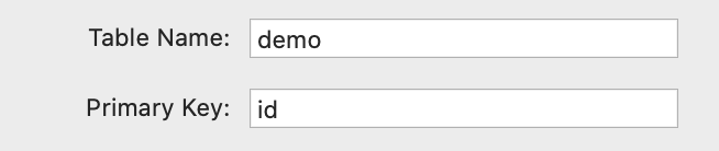
Table Name - enter the table name exactly as on the database
Primary Key - enter the name of the primary key field
Primary Key - enter the name of the primary key field
Features - select Read Only if you do not need/want your table to be editable; select CRUD if you require full Create - Update - Delete functionality.

Translation (optional) - Most of the Datably texts can be translated. This setting provides the following options:
None - no translations are used
Custom - you can specify a locale manually and the matching translation will always be applied; then add the Translation Stack (a sub-stack of the Table stack) and start translating.
None - no translations are used
Custom - you can specify a locale manually and the matching translation will always be applied; then add the Translation Stack (a sub-stack of the Table stack) and start translating.

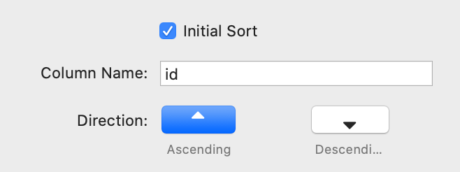
Initial Sort - if checked, the table will be defined with an initial sorter
Column Name - specify the column name which will be used for sorting
Direction - specifies the sorting direction - ascending or descending
Column Name - specify the column name which will be used for sorting
Direction - specifies the sorting direction - ascending or descending
Grouping by Field - rows can be grouped by a common field value
Group By - enter the name if the relevant database field
Group By - enter the name if the relevant database field

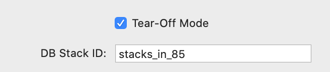
Tear-Off Mode - activate this option if you want to place the Table Stack independently of the Database Stack
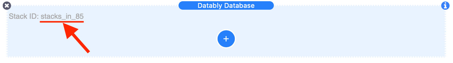
DB Stack ID - enter the ID of the Database Stack. This can be found in the Database Stack section in Edit Mode - right-click on the ID text and select "Copy", then "Paste" it into this field.
DB Stack ID - enter the ID of the Database Stack. This can be found in the Database Stack section in Edit Mode - right-click on the ID text and select "Copy", then "Paste" it into this field.
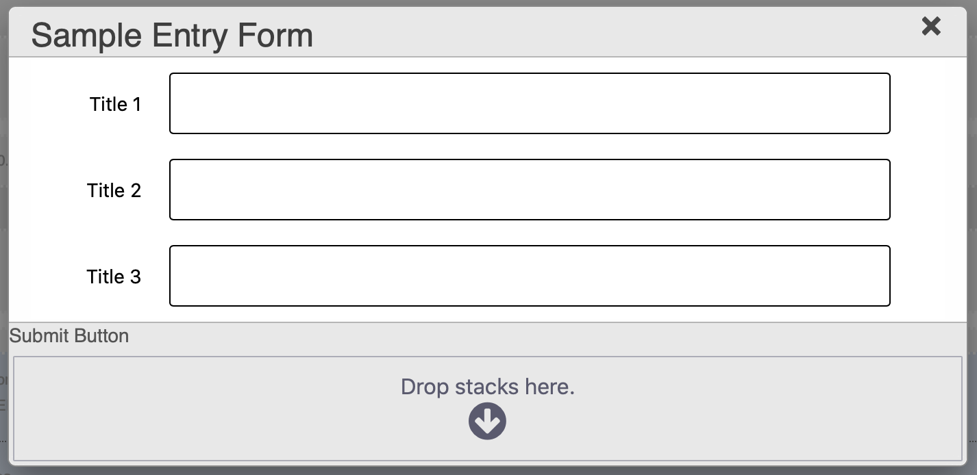
The modal window is used to enter new and edit existing records. In this section you can set the most important options.
Show Modal in Edit - if checked displays the Modal window in Edit Mode for placing the Save button

Now add a button of your choice to the "Submit Button" drop-zone. Do not configure any target or action for the button!
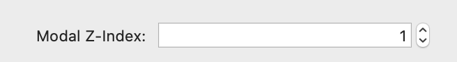
Modal Z-Index - if necessary, e.g. if there is an overlap with another stack, adjust the Z-Index of the Modal should it collide with another element on your page.
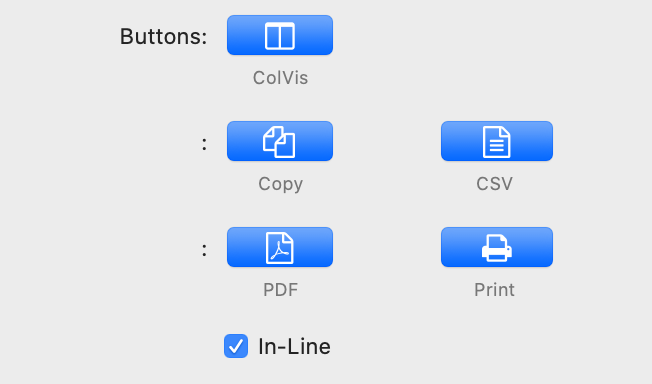
Buttons - provide additional functionality and are individually selectable. The buttons will be displayed in the upper left section of the table. In Edit Mode, the selected buttons will be indicated by their relevant place holders.
ColVis - opens a modal window where the end-user can select the visible columns
Copy - Copy table data to clipboard button
CSV - Create and save a CSV file that contains the data from the table
PDF - Create and save a PDF file that contains the data from the table
Print - provides the ability to print the table data by opening a new window in the user's browser, drawing a table with a copy of the data from the original table.
It then, by default, will automatically trigger the browser's print function allowing the end user to print the table. The window will be closed once the print is complete, or has been cancelled
In-Line - keeps the buttons in line with other elements, such as Search
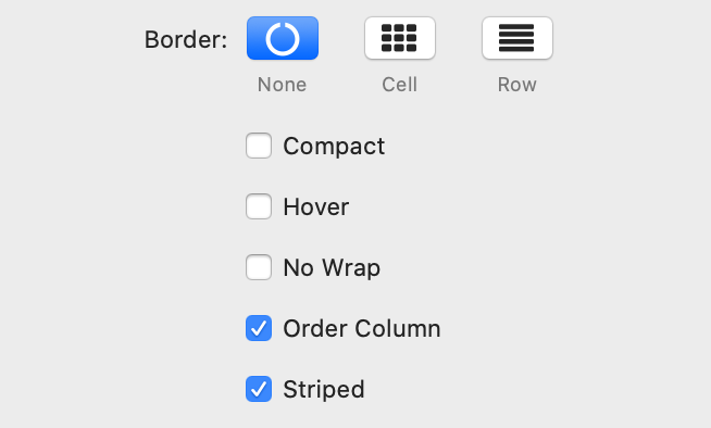
Border
None - no border
Cell - Border around all four sides of each cell
Row - Border around only the top an bottom of each row
Compact - Reduce the amount of white-space the default styling for the table uses, increasing the information density on screen
Hover - Row highlighting on mouse over
No Wrap - Disable wrapping of content in the table, so all text in the cells is on a single line
Order Column - Highlight the column that the table data is currently ordered on
Striped - Row striping
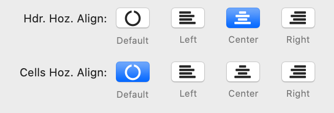
Hdr. Hoz. Align - Choose the alignment option for the header - Default, Left, Center, Right
Cell Hoz. Align - Choose the alignment option for the cells - Default, Left, Center, Right
Cell Hoz. Align - Choose the alignment option for the cells - Default, Left, Center, Right
The Responsive options can help to display table content if there is not enough space available horizontally.
If there are columns cut off, Datably will display an icon at the beginning of the row indicating that there is more information available.
Auto - By clicking on this icon, an additional line will be displayed containing the cut-off data
Modal - Clicking on this icon will open a modal window which displays the entire record as a card
You can - for each column individually - set a threshold indicating how long Datably should try to keep a column in the visible area. See Column documentation.

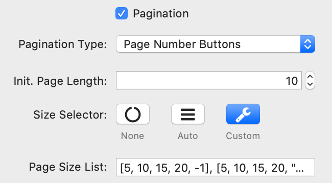
Datably can split the rows in tables into individual pages, which is an efficient method of showing a large number of records in a small space. The end user is provided with controls to request the display of different data as they navigate through the data.
Pagination Type - Datably has six built-in paging button arrangements:
Init. Page Length - Sets the initial page length when the table is initially loaded. This can be overridden by the end user if the option Size Selector is activated
Size Selector - When pagination is enabled, this option will control the display of an option for the end user to change the number of records to be shown per page.
Auto - The page length menu is automatically calculated
Custom - This parameter allows you to specify the entries in the length drop down select list that Datably shows when pagination is enabled.
The page length values must always be integer values > 0, with the sole exception of -1. When -1 is used as a value this tells Datably to disable pagination (i.e. display all rows).
Examples for Custom entries:
Show options 10, 25, 50, 75 and 100 records:
Show options 10, 25, 50 and all records:
Pagination Type - Datably has six built-in paging button arrangements:
- Page Number Buttons
- 'Previous' and 'Next' Buttons
- 'Previous' and 'Next' buttons, plus page numbers
- 'First', 'Previous', 'Next' and 'Last' buttons
- 'First', 'Previous', 'Next' and 'Last' buttons, plus page numbers
- 'First' and 'Last' buttons, plus page numbers
Init. Page Length - Sets the initial page length when the table is initially loaded. This can be overridden by the end user if the option Size Selector is activated
Size Selector - When pagination is enabled, this option will control the display of an option for the end user to change the number of records to be shown per page.
Auto - The page length menu is automatically calculated
Custom - This parameter allows you to specify the entries in the length drop down select list that Datably shows when pagination is enabled.
The page length values must always be integer values > 0, with the sole exception of -1. When -1 is used as a value this tells Datably to disable pagination (i.e. display all rows).
Examples for Custom entries:
Show options 10, 25, 50, 75 and 100 records:
[ 10, 25, 50, 75, 100 ]Show options 10, 25, 50 and all records:
[ [10, 25, 50, -1], [10, 25, 50, "All"] ]