• Theme Stack

    Drag the Datably Theme Stack into your Project

  • Datably Stack

    Drag the Datably Stack into your project

  • Database Stack

    Configure the Database Stack

  • Table Stack

    Configure the Table Stack

  • Column Stacks

    Place & configure Column Stacks

  • Translation Stack

    Translate/localize with Translation Stack (optional)

Column Stacks

In Datably, Column Stacks represent the fields of a table. There are many different Column types available which are used for different data types or special features.
This section explains the general process of placing and configuring the Basic Column Stack.
The different Column types available in Datably are described in detail here.

Important

If you create a CRUD table, make sure to include all columns which are defined as mandatory in your table definition, otherwise your database will reject any changed or newly added records!

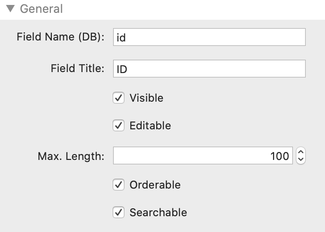
Step 1: Set Column Information

Field Name (DB) - enter the field name exactly as on the database
Field Title - enter the name as you want to see it on the web page
Visible - Enable or disable the display of this column
Editable - Make this column editable. The Primary Key should not be editable if it is a self incrementing number!
Max. Length - Set the maximum length of the input field if Editable is selected. Should be the same value as in the field definition in your database
Orderable - Enable or disable ordering on this column
Searchable - Enable or disable search on the data in this column
Tipp: To reduce guesswork and errors, it is very helpful if you have the definition of your database table open while setting these values!
Tipp 2: Make sure to use a particular database field only once per Datably table!

Step 2: Set Validator

Required - Marks this field as required in the edit/add modal window and validates if an entry is present

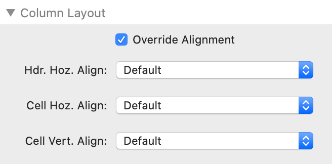
Step 3 (optional): Define Column Layout

The settings in this section override the table-wide layout options and are therefore optional.
Override Alignment - Instructs the Column stack to apply its own alignment settings, thus overriding the table-wide settings
Hdr. Hoz. Align - Choose the alignment option for the header - Default, Left, Center, Right
Cell Hoz. Align - Choose the alignment option for the cell - Default, Left, Center, Right
Cell Vert. Align - Choose the vertical alignment option for the cell in relation to the other cells in the table - Top, Middle, Bottom

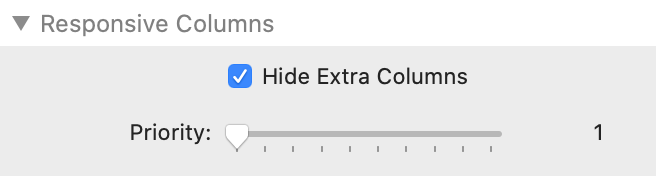
Step 4 (optional): Define Responsive Behaviour

All Column Stacks are responsive by default. If you have specific requirements, you can set them in this section.
Hide Extra Columns - Enable and configure the Responsive extension for Datably.
Datably will automatically hide columns in a table so that the table fits horizontally into the space given to it.
Priority - If Datably removes columns from the display, it does so, by default, from right to left (i.e. the rightmost column will be removed first). You may wish to assign your own column visibility priority to the columns, telling Datably which columns it should remove before others

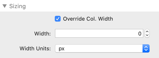
Step 5 (optional): Sizing

Override Column Width - Instructs Datably to use this manual setting instead of automatically calculating the optimal width
Width - Enter the relevant width
Width Units - Select the appropriate unit (px, %, em, rem)

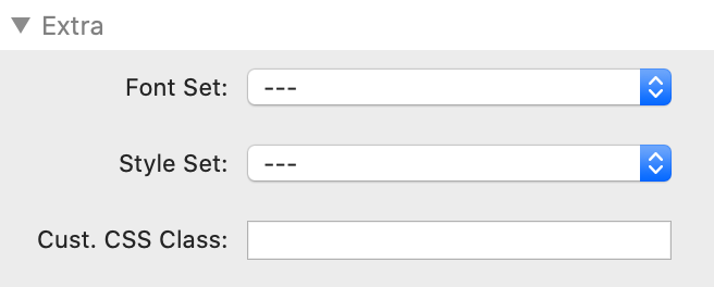
Step 6 (Optional): Extra Formatting Options

With "Font-Set" and "Style-Set" you can use fonts and styles which you have defined either with the Font and/or Style stacks in Platform to with the Gutenberg Stack.

Under "Custom CSS Class" you enter the name of a CSS class which you have defined with either the Gutenberg Stack or the Font and/or Style stacks included in Platform. FontPro should also work, although this has not been tested.
For example, if you set the scope of your Style set to "Selector" and entered the name ".myCSSClass", you could enter this name here and thus have these settings applied to the stack(s) which you have put inside Wrap.

You can even target more detailed CSS elements: if you wanted to target an h3 headline with an individual CSS selector, you would for example enter the name ".myCSSClass h3" in Stilo and "myCSSClass" (no dot!) in Wrap. This will target any h3 element within Wrap. Font or Style settings work exactly the same way.
Navigio Icon

Made by Navigio