Query Strings (GET Parameters) can only be tested on the published site!

The Datably Table stack represents a table in the database as well as on the web page. This stack provides access to the table data as well as powerful formatting features.
You can have as many tables per Database Stack as you like.
You can have as many tables per Database Stack as you like.
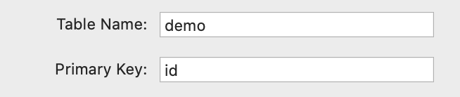
Table Information
- Table Name - enter the table name exactly as on the database
- Primary Key - enter the name of the primary key field
Datably provides several ways to influence the result set:
- Full unfiltered
- Via URL Query Strings
- Fixed Column selection and Filters (set inside the Stack)
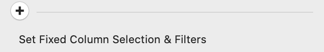
Option Closed (+ Sign visible) - no default column selection or filter is applied. It is possible to provide column selections and filters through URL Query Strings (a.k.a. GET Parameters). The Query String is set up exactly as explained below. Example with column selection:
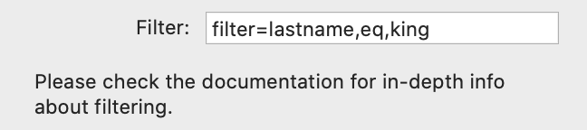
Example with filter only:
?include=lastname,firstname,number&filter=lastname,eq,smithExample with filter only:
?filter=lastname,eq,smith

Option Open (- Sign visible) - fixed (default) column selections and filters are applied via the controls which are enabled now. Functionality see below.
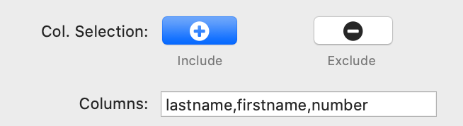
Col. Selection - select if you want to specify individual table fields. This selection happens on the server and can drastically improve performance because not all data is transferred to the client. There are three options:
- All - all table fields are selected
- Include - opens an input field where you specify which fields are included. This is a comma separated list without any blanks
- Exclude - opens an input field where you specify which fields are excluded. This is a comma separated list without any blanks
Filter - enter the filter criteria as documented below.
Server-side filtering can drastically improve performance because not all data is transferred to the client.
Server-side filtering can drastically improve performance because not all data is transferred to the client.
Filters provide search functionality, on list calls, using the "filter" parameter. You need to specify the column name, a comma, the match type, another commma and the value you want to filter on. These are supported match types:
- "cs": contain string (string contains value)
- "sw": start with (string starts with value)
- "ew": end with (string end with value)
- "eq": equal (string or number matches exactly)
- "lt": lower than (number is lower than value)
- "le": lower or equal (number is lower than or equal to value)
- "ge": greater or equal (number is higher than or equal to value)
- "gt": greater than (number is higher than value)
- "bt": between (number is between two comma separated values)
- "in": in (number or string is in comma separated list of values)
- "is": is null (field contains "NULL" value)
Filters can be a by applied by repeating the "filter" parameter in the filter string, for example:
This will request all records "where id > 1 and id < 3". If you wanted "where id = 2 or id = 4" you should write:
As you see we added a number to the "filter" parameter to indicate that "OR" instead of "AND" should be applied. Note that you can also repeat "filter1" and create an "AND" within an "OR". Since you can also go one level deeper by adding a letter (a-f) you can create almost any reasonably complex condition tree.
filter=id,gt,1&filter=id,lt,3This will request all records "where id > 1 and id < 3". If you wanted "where id = 2 or id = 4" you should write:
filter1=id,eq,2&filter2=id,eq,4As you see we added a number to the "filter" parameter to indicate that "OR" instead of "AND" should be applied. Note that you can also repeat "filter1" and create an "AND" within an "OR". Since you can also go one level deeper by adding a letter (a-f) you can create almost any reasonably complex condition tree.
This parameter limits the number of returned records. Enter '0' for no limit.

Features
- Read Only - select this option if you do not need/want your table to be editable;
- CRUD - select this option if you require full Create - Update - Delete functionality.

Translation - Most of the Datably texts can be translated. This setting provides the following options:
- None - no translations are used
- Custom - you can specify a locale manually and the matching translation will always be applied; then add the Translation Stack (a sub-stack of the Table stack) and start translating.

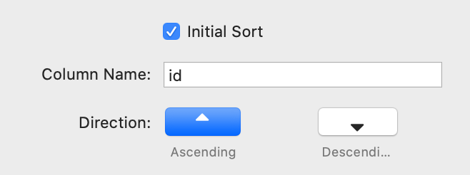
Initial Sort - if checked, the table will be defined with an initial sorter
- Column Name - specify the column name which will be used for sorting
- Direction - specifies the sorting direction - ascending or descending
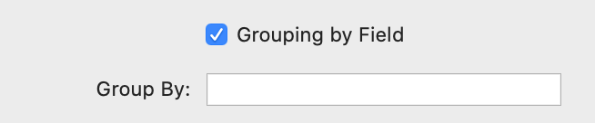
Grouping by Field - rows can be grouped by a common field value
- Group By - enter the name if the relevant database field
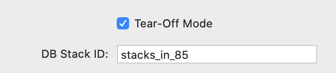
Tear-Off Mode - activate this option if you want to place the Table Stack independently of the Database Stack
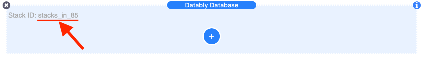
- DB Stack ID - enter the ID of the Database Stack. This can be found in the Database Stack section in Edit Mode - right-click on the ID text and select "Copy", then "Paste" it into this field.
The modal window is used to enter new and edit existing records. In this section you can set the most important options.
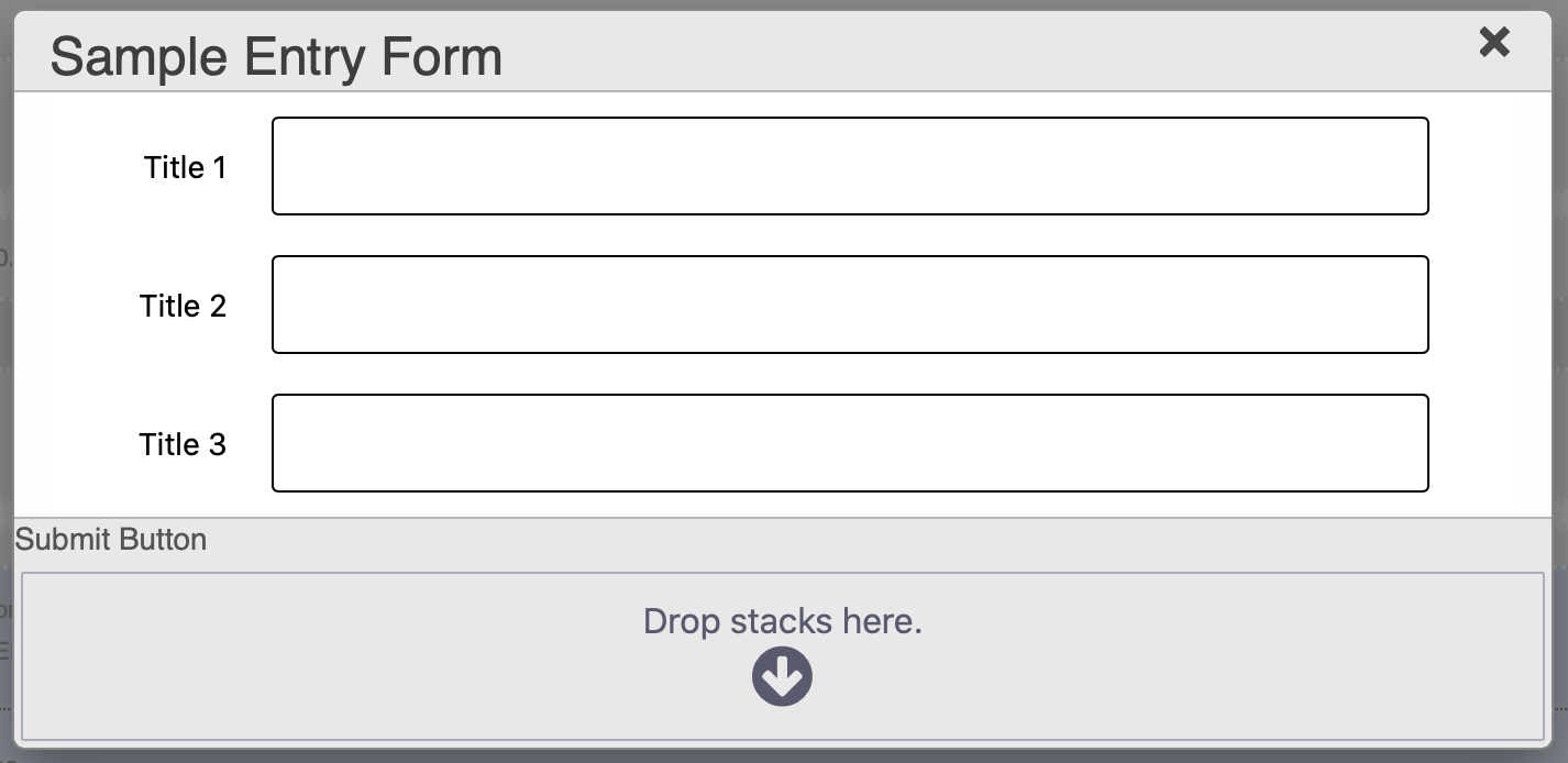
Show Modal in Edit - if checked displays the Modal window in Edit Mode for placing the Save button

Add a button of your choice to the "Submit Button" drop-zone. Do not configure any target or action for the button!
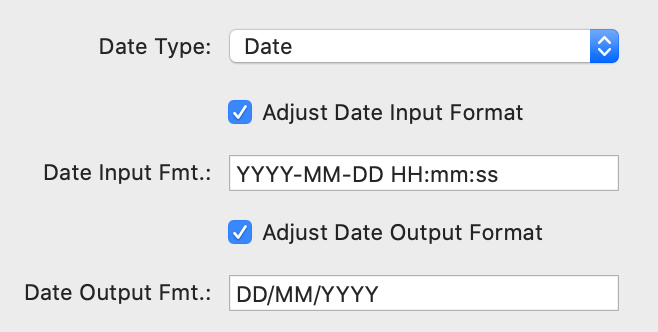
Date Type Settings
Depending on the type of Date field in your database table, you might have to change these settings.
If you have more than one date/date-time field, be aware that these settings are applicable for the entire table!
Date Type - choose between Date and Date-Time
Adjust Date Input Format - if selected you can enter the mask for your date input format
Adjust Date Output Format - if selected you can enter the mask for your date output format
The different year, month, and day tokens are documented here
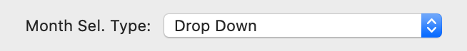
Month Selector Type
Select either "Drop Down" or "Static". If Number Months is larger than one, the Selector Type will always be "Static".
Select either "Drop Down" or "Static". If Number Months is larger than one, the Selector Type will always be "Static".
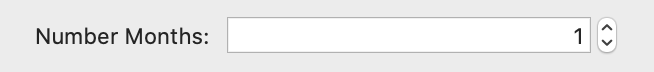
Number Months
Sets the number of simultaneously visible months. If this value is larger than one, the Month Selector Type will always be static.
Sets the number of simultaneously visible months. If this value is larger than one, the Month Selector Type will always be static.
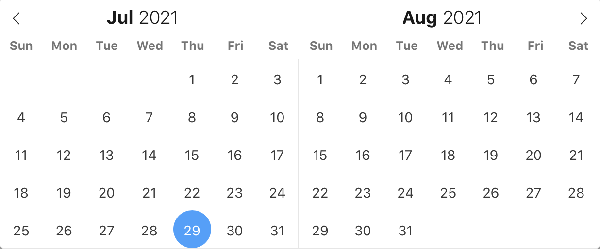
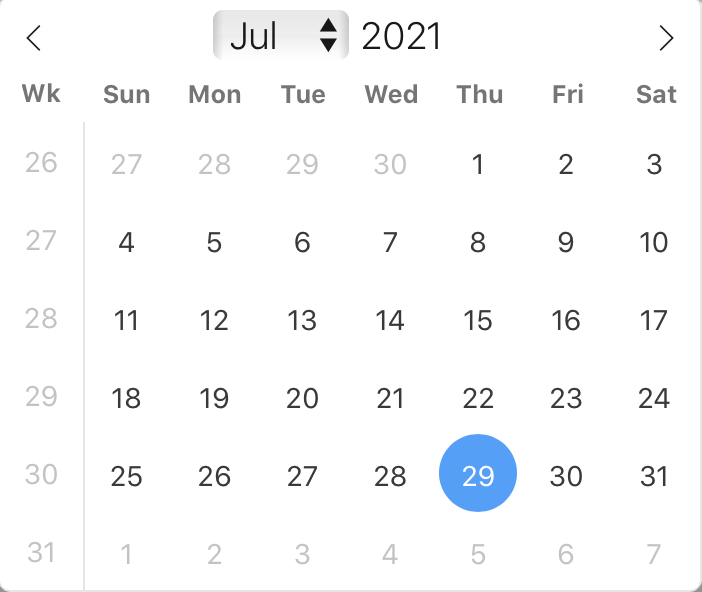
Week Numbers - enables display of week numbers in calendar if Number Months is set to 1
Short Curr. Month - shows the month using the shorthand version (ie, Sep instead of September)
Time 24h - displays time picker in 24 hour mode without AM/PM selection when enabled
Short Curr. Month - shows the month using the shorthand version (ie, Sep instead of September)
Time 24h - displays time picker in 24 hour mode without AM/PM selection when enabled

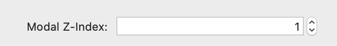
Modal Z-Index - adjust the Z-Index of the Modal should it collide with another element on your page
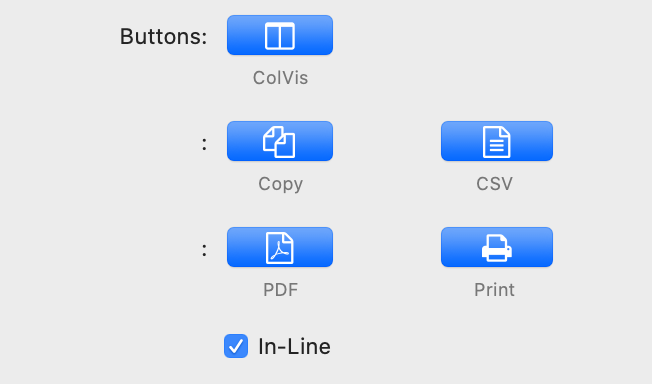
Buttons - provide additional functionality and are individually selectable. The buttons will be displayed in the upper left section of the table. In Edit Mode, the selected buttons will be indicated by their relevant place holders.
ColVis - opens a modal window where the end-user can select the visible columns
Copy - Copy table data to clipboard button
CSV - Create and save a CSV file that contains the data from the table
PDF - Create and save a PDF file that contains the data from the table
Print - provides the ability to print the table data by opening a new window in the user's browser, drawing a table with a copy of the data from the original table.
It then, by default, will automatically trigger the browser's print function allowing the end user to print the table. The window will be closed once the print is complete, or has been cancelled
In-Line - keeps the buttons in line with other elements, such as Search
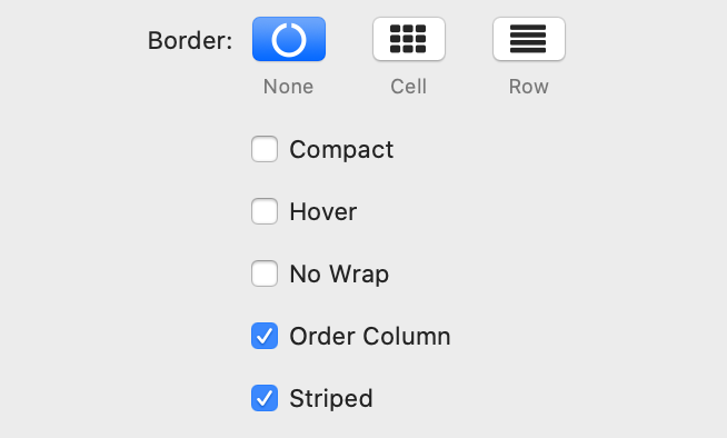
Border
None - no border
Cell - Border around all four sides of each cell
Row - Border around only the top an bottom of each row
Compact - Reduce the amount of white-space the default styling for the table uses, increasing the information density on screen
Hover - Row highlighting on mouse over
No Wrap - Disable wrapping of content in the table, so all text in the cells is on a single line
Order Column - Highlight the column that the table data is currently ordered on
Striped - Row striping
Scroll - X - Enable horizontal scrolling. When a table is too wide to fit into a certain layout, or you have a large number of columns in the table, you can enable horizontal (x) scrolling to show the table in a viewport, which can be scrolled.
This works well in combination with No Wrap to keep your browser from wrapping your columns
Scroll - Y - Enable vertical scrolling. Vertical scrolling will constrain the DataTable to the given height, and enable scrolling for any data which overflows the current viewport. This can be used as an alternative to paging to display a lot of data in a small area (although paging and scrolling can both be enabled at the same time if desired)

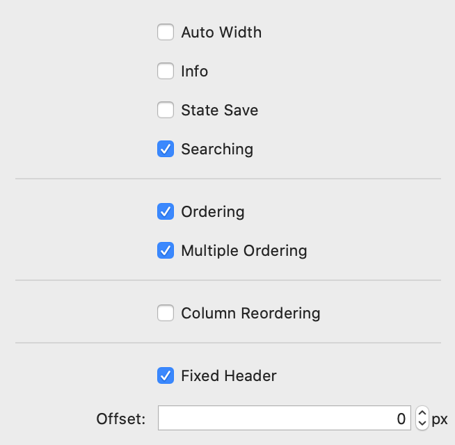
Auto Width - Enable or disable automatic column width calculation. This can be disabled as an optimisation (it takes a finite amount of time to calculate the widths) if the tables widths are passed in using the column-based settings
Info - When this option is enabled, Datably will show information about the table including information about filtered data if that action is being performed
State Save - When enabled Datably will store state information such as pagination position, display length, filtering and sorting. When the end user reloads the page the table's state will be altered to match what they had previously set up
Searching - This option allows the search abilities of Datably to be enabled or disabled. Searching in Datably is "smart" in that it allows the end user to input multiple words (space separated) and will match a row containing those words, even if not in the order that was specified (this allow matching across multiple columns)
Ordering - When enabled, Datably allows end users to click on the header cell for each column, ordering the table by the data in that column. Note that the ability to add or remove sorting of individual columns can be disabled by the Orderable option for each column. This parameter is a global option - when disabled, there are no sorting actions applied by Datably at all
Multiple Ordering - When ordering is enabled (see above), you can allow users to sort multiple columns by shift clicking upon the header cell for each column. Although this can be quite useful for users, it can also increase the complexity of the order, potentiality increasing the processing time of ordering the data. Therefore, this option is provided to allow this shift-click multiple column ability.
Column Reordering - This setting provides the option for end users to reorder columns in a table by click and drag
Fixed Header - Provides the ability to show a header that is sticky - i.e. the element will affix itself to the top of the window as the end user scrolls through the table. The result is that the end user will be able to see the header of the table as they scroll through the table. The fixed elements will then scroll off the page as the user scrolls past the table.
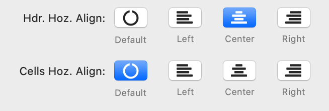
Hdr. Hoz. Align - Choose the alignment option for the header - Default, Left, Center, Right
Cell Hoz. Align - Choose the alignment option for the cells - Default, Left, Center, Right
Cell Hoz. Align - Choose the alignment option for the cells - Default, Left, Center, Right
The Responsive options can help to display table content if there is not enough space available horizontally.
If there are columns cut off, Datably will display an icon at the beginning of the row indicating that there is more information available.
Auto - By clicking on this icon, an additional line will be displayed containing the cut-off data
Modal - Clicking on this icon will open a modal window which displays the entire record as a card
You can - for each column individually - set a threshold indicating how long Datably should try to keep a column in the visible area. See Column documentation.

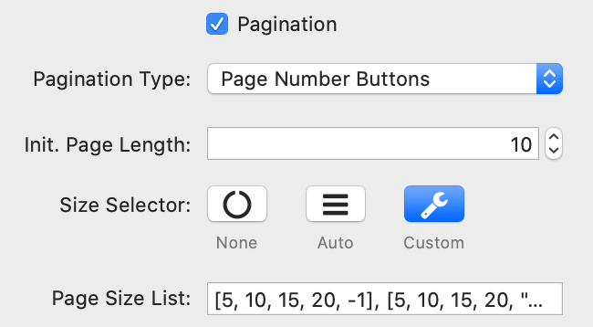
Datably can split the rows in tables into individual pages, which is an efficient method of showing a large number of records in a small space. The end user is provided with controls to request the display of different data as they navigate through the data.
Pagination Type - Datably has six built-in paging button arrangements:
Init. Page Length - Sets the initial page length when the table is initially loaded. This can be overridden by the end user if the option Size Selector is activated
Size Selector - When pagination is enabled, this option will control the display of an option for the end user to change the number of records to be shown per page.
Auto - The page length menu is automatically calculated
Custom - This parameter allows you to specify the entries in the length drop down select list that Datably shows when pagination is enabled.
The page length values must always be integer values > 0, with the sole exception of -1. When -1 is used as a value this tells Datably to disable pagination (i.e. display all rows).
Examples for Custom entries:
Show options 10, 25, 50, 75 and 100 records:
Show options 10, 25, 50 and all records:
Pagination Type - Datably has six built-in paging button arrangements:
- Page Number Buttons
- 'Previous' and 'Next' Buttons
- 'Previous' and 'Next' buttons, plus page numbers
- 'First', 'Previous', 'Next' and 'Last' buttons
- 'First', 'Previous', 'Next' and 'Last' buttons, plus page numbers
- 'First' and 'Last' buttons, plus page numbers
Init. Page Length - Sets the initial page length when the table is initially loaded. This can be overridden by the end user if the option Size Selector is activated
Size Selector - When pagination is enabled, this option will control the display of an option for the end user to change the number of records to be shown per page.
Auto - The page length menu is automatically calculated
Custom - This parameter allows you to specify the entries in the length drop down select list that Datably shows when pagination is enabled.
The page length values must always be integer values > 0, with the sole exception of -1. When -1 is used as a value this tells Datably to disable pagination (i.e. display all rows).
Examples for Custom entries:
Show options 10, 25, 50, 75 and 100 records:
[ 10, 25, 50, 75, 100 ]Show options 10, 25, 50 and all records:
[ [10, 25, 50, -1], [10, 25, 50, "All"] ]
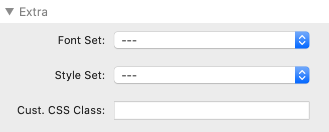
With "Font-Set" and "Style-Set" you can use fonts and styles which you have defined with the Font and/or Style stacks.
Under "Custom CSS Class" you enter the name of a CSS class which you have defined with either the Gutenberg Stack or the Font and/or Style stacks included in Platform. FontPro should also work, although this has not been tested.
For example, if you set the scope of your Style set to "Selector" and entered the name ".myCSSClass", you could enter this name here and thus have these settings applied to the stack(s) which you have put inside Wrap.
You can even target more detailed CSS elements: if you wanted to target an h3 headline with an individual CSS selector, you would for example enter the name ".myCSSClass h3" in Stilo and "myCSSClass" (no dot!) in Wrap. This will target any h3 element within Wrap. Font or Style settings work exactly the same way.